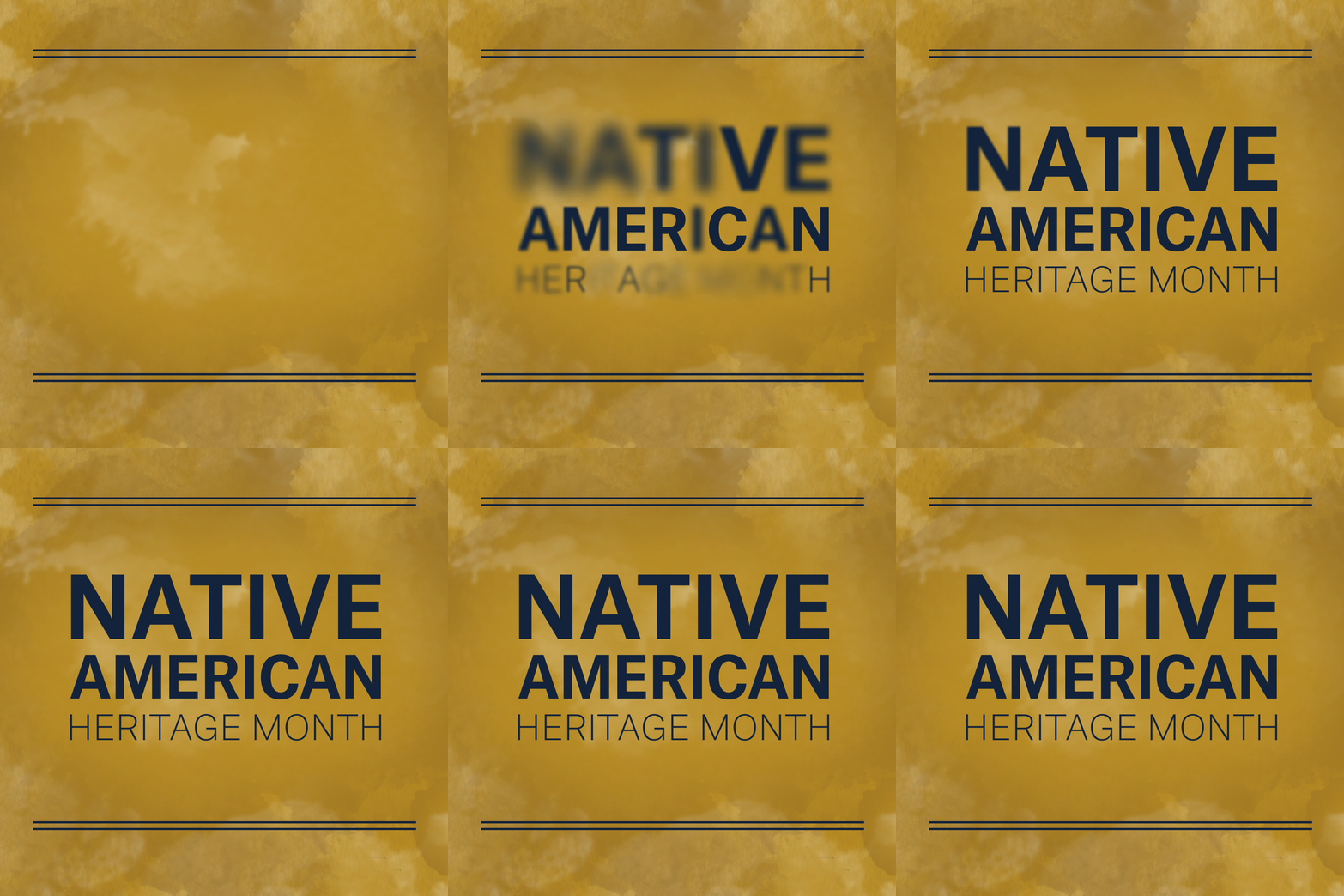
Native American Heritage Month GIF
In this project, I designed a gif for Quinnipiac University to use across digital and social platforms to mark Native American Heritage Month. I was responsible for bringing the project from concept to completion, conducting research to support the design, and ensuring it met the specifications for each platform.
Final Design
Brief
The scope of this project was to create a visual element for Quinnipiac University to use on social media and their website to increase awareness of Native American Heritage Month. It could be static or motion and simultaneously represent the university and Native American Heritage Month.
Ideation & Exploration
I began by researching Native American Heritage Month and how it is acknowledged by different institutions including the town of Hamden where Quinnipiac is located, universities across the country, and national organizations like the Smithsonian and the National Congress of American Indians. Then I began to research visual representations and their meaning to determine what might be appropriate. This step was critical to avoid appropriation.
I also researched the Quinnipiac people, their history, and the origins of the name “Quinnipiac.” I finished with a 12-page document that I used to guide the design. My research was also useful when the final design was being reviewed as it helped me justify design choices.
Design Process
I made two compositions to explore different options, giving the rest of my team a choice about what they think aligns most with our goals. One composition used an image of Sleeping Giant State Park which is a meaningful site for Native American people in the Hamden area. It is also a landmark associated with Quinnipiac University because it is across the street from the main campus. The second composition delt only with words and an abstract natural pattern. It utilized navy and shades of yellow and tan which are both natural colors and similar to Quinnipiac’s colors.


We decided to move forward with the second composition that delt only with text. While the first composition is more colorful and more visually interesting, it had a higher potential for backlash because the university’s land acknowledgment statement is still underway. The second composition needed something to make it more visually interesting, so I decided to add motion to the design. I used the gaussian blur filter in AfterEffects to make the letters fade in at random making it more eye-catching but still simple.
Results
The outcome of this project was a static and motion design for social media and the web recognizing Native American Heritage Month. The gif is used on Facebook, Instagram, LinkedIn, and Twitter and the static image is used for the website. You can view it live on all of those platforms below:


