Space Ballroom Event Poster
In this project, I designed a piece of print collateral working from data sets of a local venue. I was responsible for selecting the venue, ensuring there was enough data to work from, and shooting original photographs to use in the final product. This project was done independently to refine my typographical and photography skills and was not presented to or used by Space Ballroom, the selected venue.

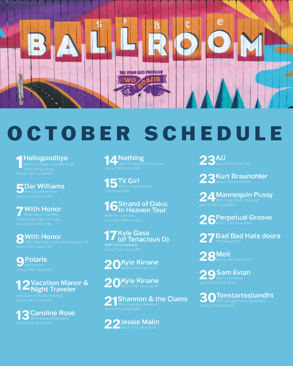
Final poster design
Brief
The scope of this project was to create a calendar poster for a venue of my choice and incorporate at least twenty dates of tabular data combined with original photography for the background. This style requires a strong balance of type and imagery to create an effective composition. If commissioned by a client, this poster would be at the entryway of their business or storefront and posted in heavily trafficked areas to advertise.
The first step of this project was to determine the subject and gather information. I chose Space Ballroom, a small music venue in Hamden, Connecticut, because of my passion for music and easy accessibility to the site for photography. Once I determined that the venue had enough data to create an effective poster, I began collecting and organizing the data to inform the ideation process.
Ideation & Exploration
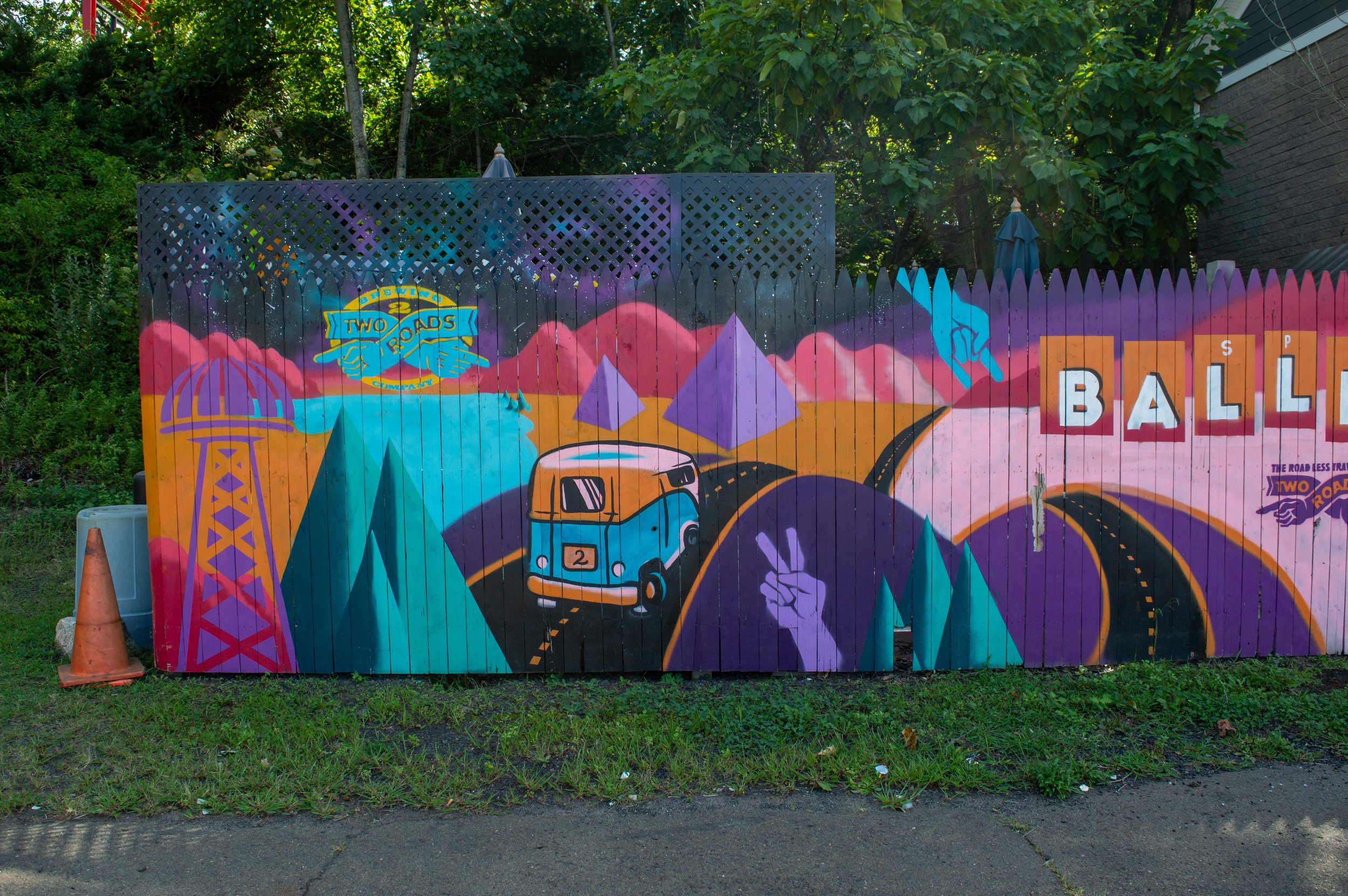
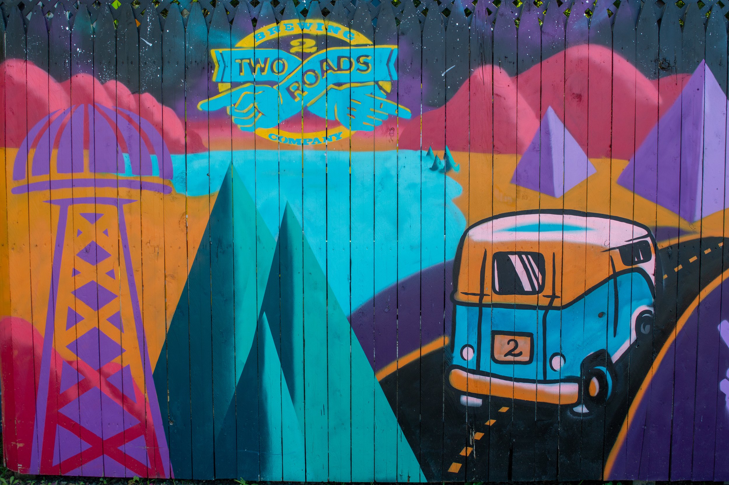
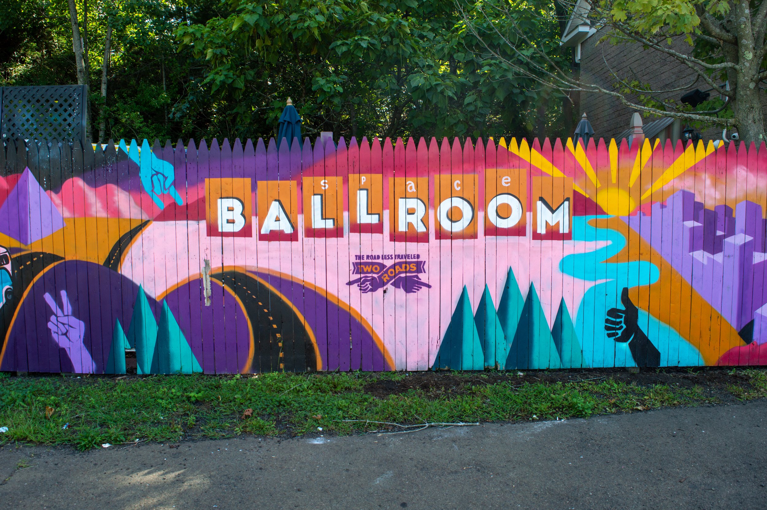
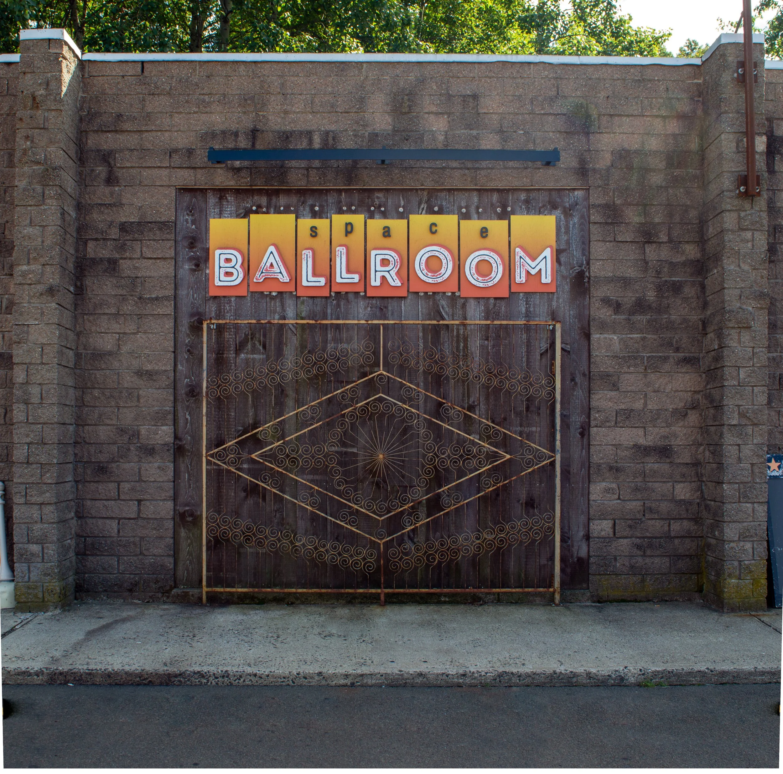
I began compiling a list of the data related to October 2021, and broke it down into categories including artists, opening acts, and showtimes. I also noted information about the venue's location, history, and social media presence. I also looked at the venue on Google Maps to see if it had any prevalent landmarks. If it did, I wanted to photograph them to use in the poster; this would make the design more novel and connected to this unique venue. If not, I planned on contacting the venue and asking to photograph a show or other indoor elements. My search on Google Maps revealed a hand painted mural and a large, presumable decorative, door with metal work and a sign with the logo hanging above it. With this knowledge, I headed to the site to shoot photos and find more inspiration for the design.
Throughout this process, I compiled visual researched in a Pinterest board which consisted primarily of calendar layouts, data visualization, and text-heavy posters. This research helped me understand the metaphors that are prevalent in calendar design, identify clichés, and learn how typography changes when used on top of images.


composition one
Design Process
Space Ballroom has two primary visual identifiers; a large decorative door and a mural painted on the fence marking the property line. I experimented with images of both in my initial compositions. Initially, I was drawn to the mural because of the vibrant colors, which align with the excitement associated with live music. It presented a major challenge because it was so busy and became disruptive to typography, preventing the viewer from easily seeing and understanding the data. These challenges led me to use the mural as a banner at the top of the poster, but this composition creates a severe separation and prevents the eye from comfortably following the information.

composition two
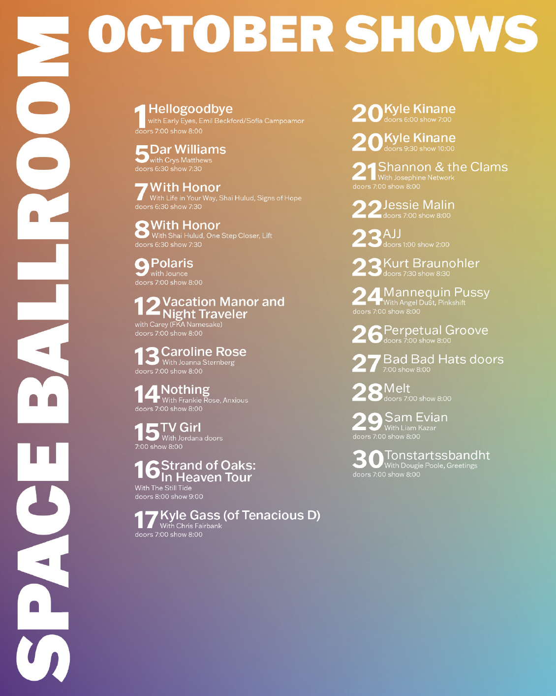
The next composition I developed used the image of the decorative door. One of the most appealing aspects of this photo is that it displays the venue's colorful logo, which is consistent with the branding on their website and social media. One of the main challenges with this comp is the overall lack of contrast both within the photo and between the type and the photo. Additionally, the intricate metalwork in the background fights with the typography reducing overall flow and readability.
composition three
The final comp I worked on experimented with elements beyond the scope of the project. I took a modern minimalistic approach that focused on color drawn from and inspired by the mural. While this comp does not comply with the requirements, it was beneficial in the design process because it helped me visualize the unique challenges of designing around a photo. Not only did I have something to compare my other two compositions to, I could also see the data more clearly from a design perspective and refine the typographical hierarchy.
Results
I chose to move forward with the second composition, using the picture of the door, because it is more conducive to typography while maintaining visual interest. Although I felt that I was on the right track with my first attempt, I needed to focus more on balance and contrast for the best possible outcome. To enhance these aspects, I began by making the background darker. I brought the image into photoshop and overlaid a black rectangle and brought down the opacity of the layer. I used the mask tool to non-destructively erase around the logo so that it remained bright and eye-catching. Next, I focused on the typography and implemented more contrasting weights and added colors to the dates within each data section. These adjustments made each section function as clearly identifiable units within the whole while effectively displaying details.
final design