Trim Winter 2023 Packaging
In this project, I created package designs for the brand Trim. Pacific World Corporation will use two designs for the packaging in the winter of 2023. I worked with the creative manager and the VP of innovation to finalize the designs and create coordinating patterns for nail files in the kits.
Brief
The project’s scope was to create winter-themed packaging for 2023 that appealed to men and women and used content from Shutterstock. Five different base kits could be used for the final product ranging from 4 to 26 pieces. We also had some freedom with the dielines and wanted to include options beyond the standard rectangular window.
Ideation & Exploration
I began by defining a target audience. Because this product will be released in winter, it will likely be used as a stocking stuffer, but I did not want to limit it to people who celebrate Christmas, so I decided to focus on winter as a whole rather than the holidays. I also researched popular winter and holiday PDQ products that become popular during the winter at retailers Pacific World Corporation works with, such as Target, Walmart, and CVS.
Design Process
Once I had established the target audience and had completed competitor research, I began browsing Shutterstock and putting content to the test. I made a template in Illustrator from PDFs of the five kits and used masks to create simple mockups showing how the image or pattern could translate to the packaging. I made 21 compositions using various styles, colors, and kit types.


I added each composition to a slideshow in Canva to easily share it with other team members and receive feedback. The feedback was to make the dielines less detailed and to make sure the j-card is a light color, so the products pop.
Of the 21 compositions, my team selected two for the final. Once leadership confirmed the selections, I downloaded the licensed content from Shutterstock and began preparing the final files and mockups.
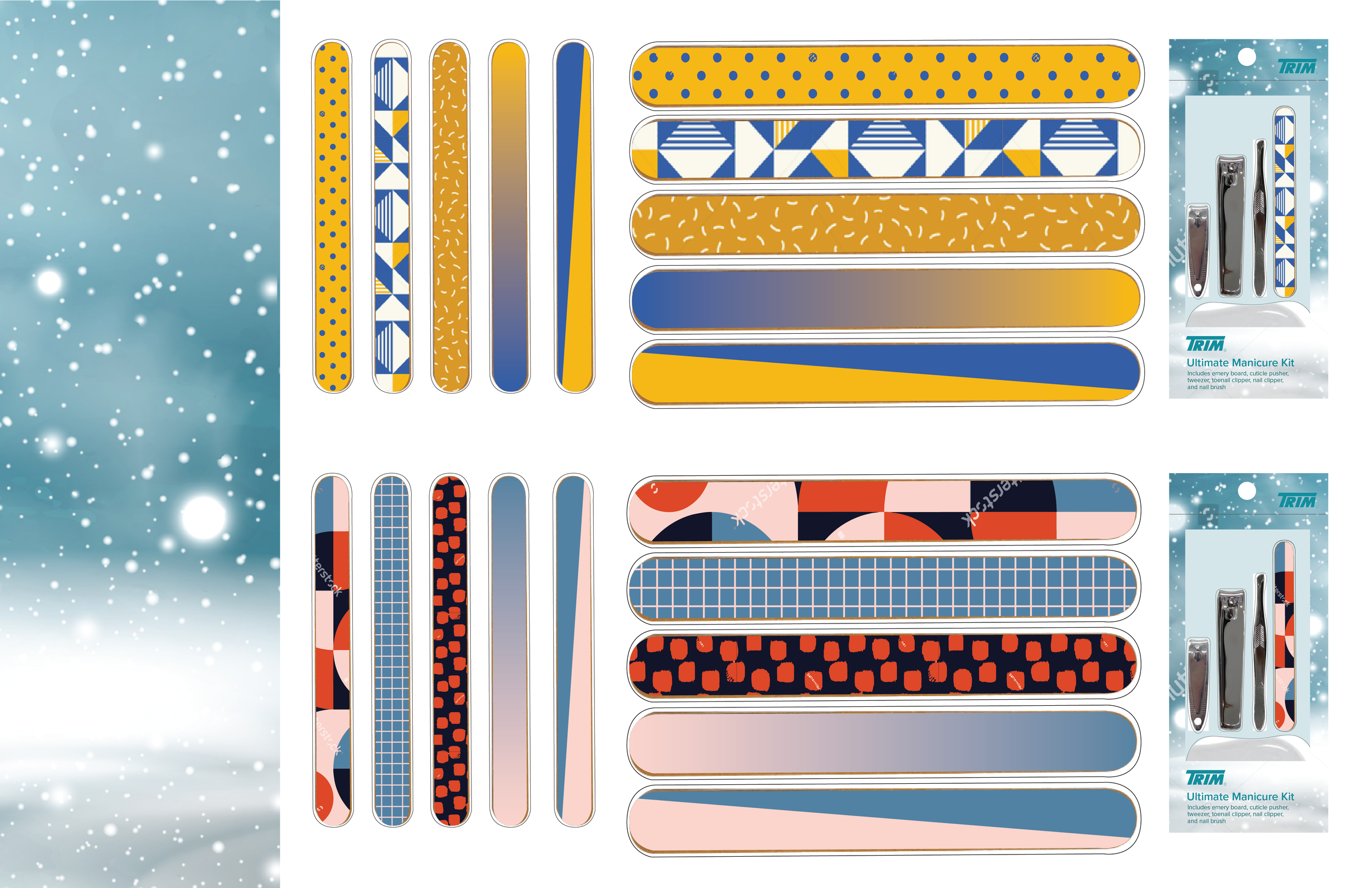
For the icicle comp, I had to simplify the dieline and then passed the file off to the creative manager to coordinate with our partners in China for manufacturing. For the other comp that used a raster image of an abstract snowy scene, I got to work on patterns for the nail files included in the kit. In this process, I created six comps showing what different patterns and colors would look like on the files and how they look next to the packaging.
I presented these to the creative manager, graphic designer, and VP of innovation and landed on a variation of the second comp that used the same patterns but different colors. Once I made the final adjustments to the design, I worked with the creative manager to develop a final file that included the Pantone colors and three patterns that our partners in China would use to manufacture samples for the final product.
Results
The outcome of this project is two package designs for the brand Trim, which will be available commercially in the winter of 2023. The final deliverable was a total of three files; one file for the icicle packaging that included the graphic and dieline, and two files for the abstract snow raster with the licensed image for the packaging, and patterns with Pantone colors for nail files in the kit.


