Skeletons in the Garden, Montage Literary and Arts Journal
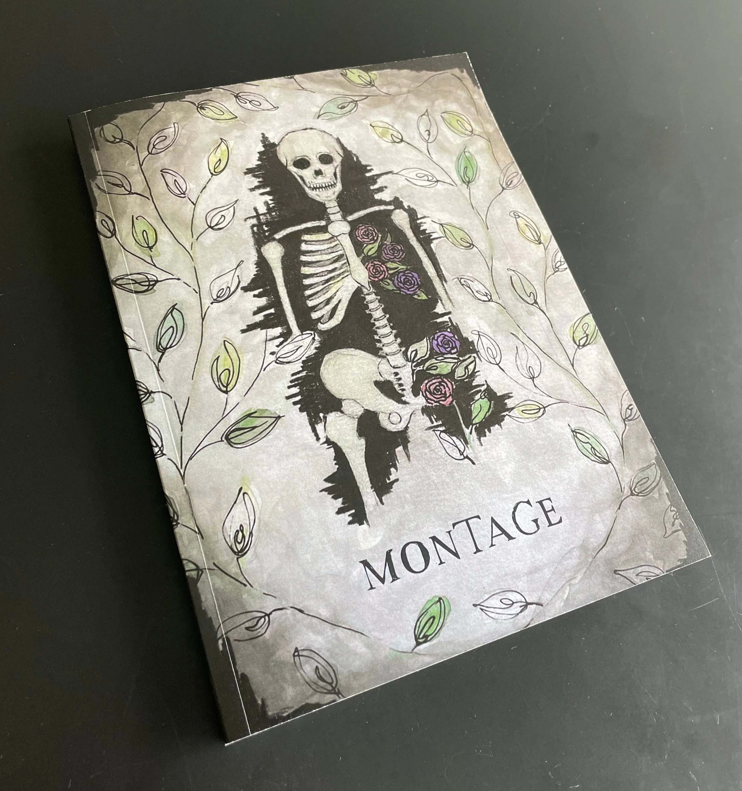
In this project, I designed the cover for the Montage Literary and Arts Spring Journal Volume 40. I was responsible for bringing the project from concept to completion using any mediums. The journal was printed at TYCO and distributed to Quinnipiac University students, staff, and faculty. It is also available online.
Final cover design
Brief
Montage Literary and Arts Journal needed a cover design for their Spring 2021 edition that was eye-catching but also matched the gloomy mood of the written works submitted after almost one year of living in the pandemic. I was faced with the challenge of channeling this energy into a design that reflects what we’ve been through without appearing too depressing.
There were almost no limitations in terms for this project. The final cover is 5.5 inches by 7.5 inches and the final designed needed to be high quality for print. I could use any medium and any color palette.
Ideation & Exploration
To begin, I met with the Editor in Chief, Joelle Gray to be briefed on the design. Together, we looked through the written works and some visual pieces so I could better understand the overall mood of the journal. I then asked her some more in-depth questions that led to a list of descriptive phrases to work from. They are as follows:
Flowers juxtaposed with something decrepit
Beauty and suffering
Skeletons in the closet/skeletons in the garden
Spooky but not off putting
Broken things, old things, haunted things
The smell of cigarette smoke
Dead among the living
Joelle and I agreed that a skeleton should be included in the final design. With this decision, we decided to name the journal Skeletons in the Garden. The only other requirement was that space be left on the cover for the title “Montage.” This element has historically been placed at the bottom of the cover; a tradition Joelle wished to continue.
Next, I began ideating. Some of the compositions included a skeleton surrounded by abandoned children’s toys and a skeleton slumped in a closet. Neither of these ideas were successful as they did not communicate the juxtaposition of beauty and suffering or the concept of the dead among the living adequately. A third design, a skeleton with flowers in its frame and surrounded by leaves was accepted for the final.
Next, I designed wireframes for a home page, events page, and schedule. When reviewing the wireframes, I realized that separating events and schedule did not make much sense so I omitted the schedule and included a registration page describing different passes that could be bought to the event. Then I made the first mockups using XD.
Design Process
The original sketch was done with pencil, felt tip pen, and colored pencil in my sketchbook. Once approved, I experimented with different mediums in my sketchbook such as pen and ink. After deciding that pencil, felt tip pen, and watercolor would be best, began sketching the final on watercolor paper. I chose this paper specifically for two reasons; I wanted to use watercolor which would take well to this paper and wanted the texture to be visible on the published cover. The texture of the paper would give even freshly printed journal a slightly worn look, consistent with the descriptor “old things.”
When the final cover was complete, I took a photo of it and opened it in Photoshop. I made some basic edits. While I tried to take the photo from directly above, it was not perfect, so I used the perspective warp tool to make sure it perfectly flat. I also increased the saturation and contrast. While the physical piece looks rather bright, all photos I took appeared duller and flatter. These adjustments made the digital copy more appealing and truer to the original piece. Finally, I added the title, “Montage,” in the typeface selected by Joelle Gray, Editor in Chief.
Results
The outcome of this project was a 5.5 inch by 7.5 inch cover deign for Montage Literary and Arts Journal. 350 copies were printed, and it was published digitally on issuu.com.
Initial cover sketch
Final unedited cover design
Final cover design


