Trim X Dutch Bros. Collaboration Pitch
In this project, I created packaging concepts for a collaboration between Dutch Bros. Coffee and Trim, a Pacific World Corporation brand. This project was a fire drill carried from concept to completion in roughly 5 hours.

Brief
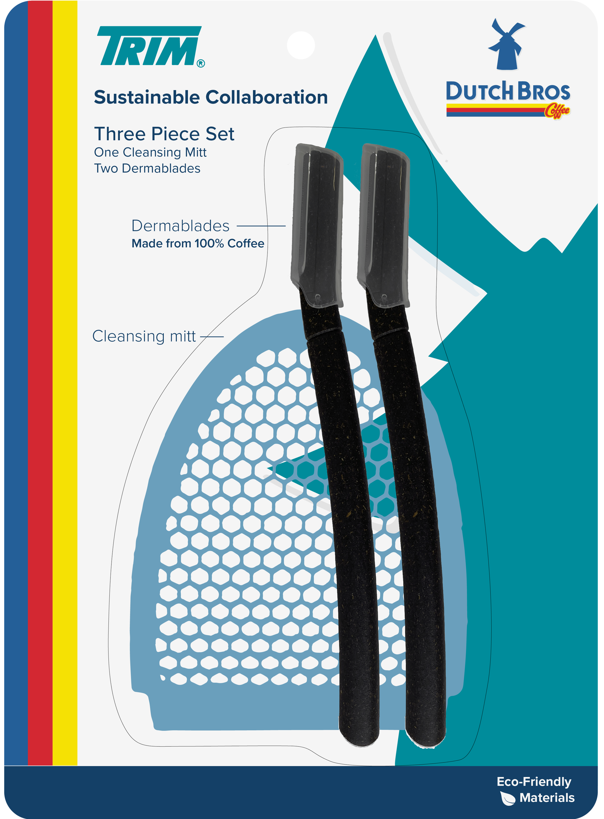
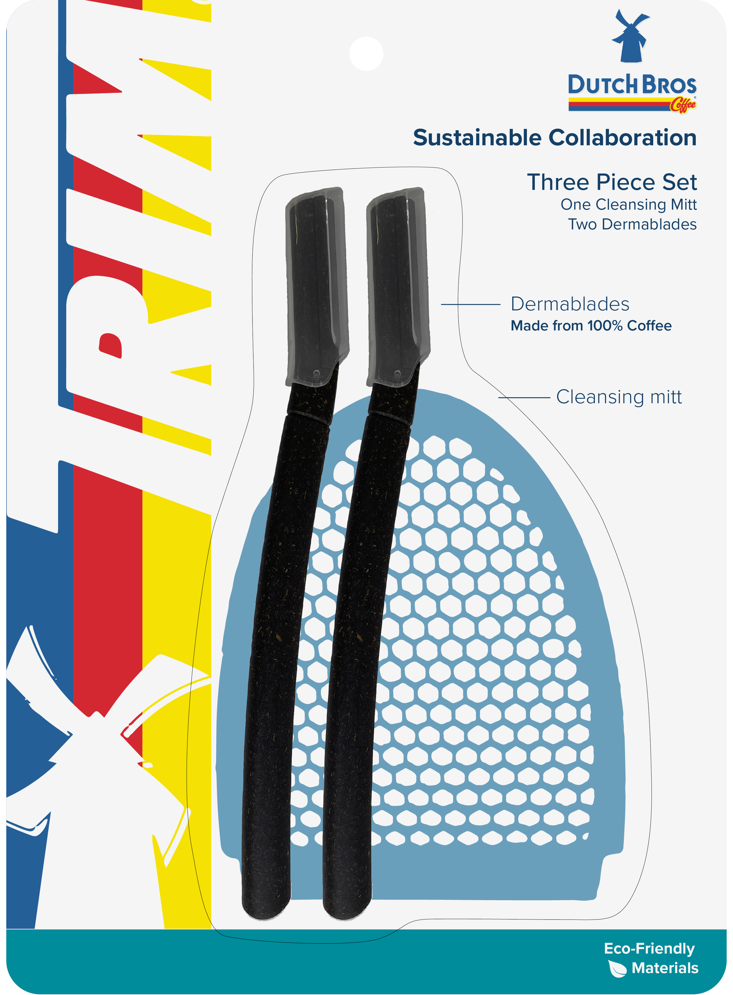
This project's scope was to explore a collaboration between Dutch Bros. Coffee and Trim that uses recycled coffee grounds as a handle for a dermablade. I was responsible for photographing the product for mockups, pitching compositions, and creating a one-page pitch for the creative manager and VP of innovation to present the three best designs.
Ideation & Exploration
Before I fully dove into ideation and exploration, I familiarized myself with the products. I took photos of the dermablade to use in the rough mockups for the final presentation. I took the picture on my iPhone and then brought it into Photoshop to clean it up and remove the background so I could use it in Illustrator. When I brought the products into Illustrator, I worked with them at scale to quickly provide dimensions if needed and print realistic mockups of the final proposed packaging.


Original photo:
Edited photo:
There were no assets or copy for this project, so I began by researching Dutch Bros. and downloading foundational content such as their logo and identifying brand colors. Next, I focused on establishing two distinct approaches to appearance: eco-friendly product branding and brand-focused packaging. The brief was somewhat vague regarding the goal of the packaging, and these two aspects were the most logical ways of interpreting the desired outcome.
Design Process
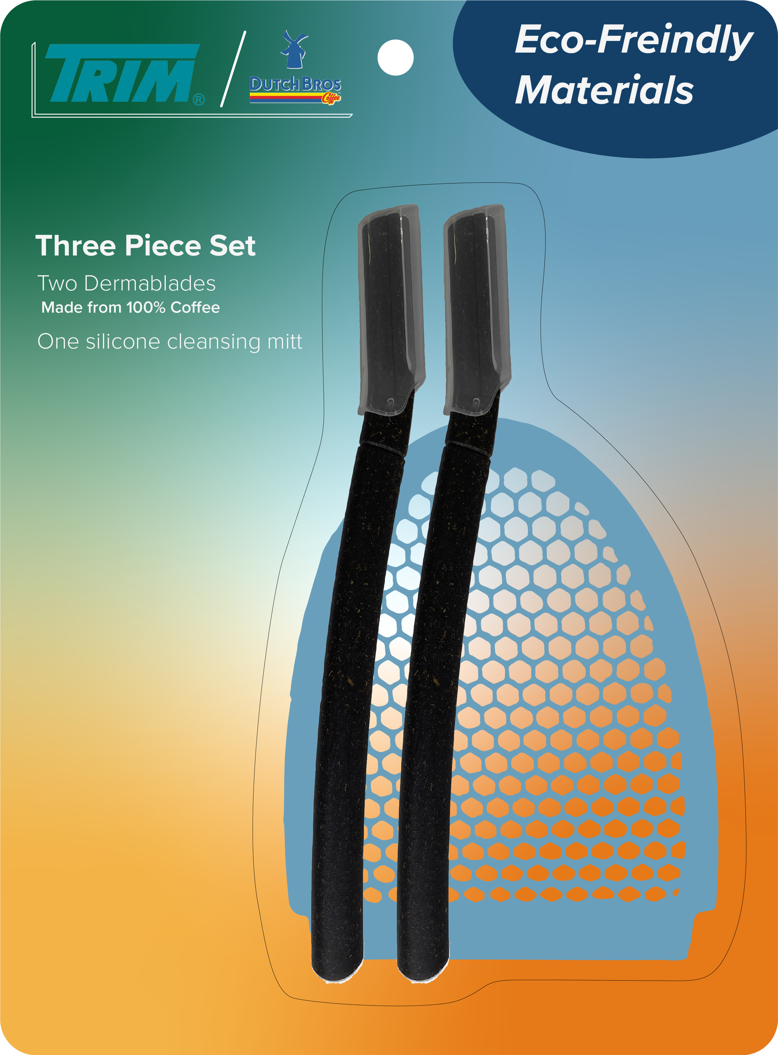
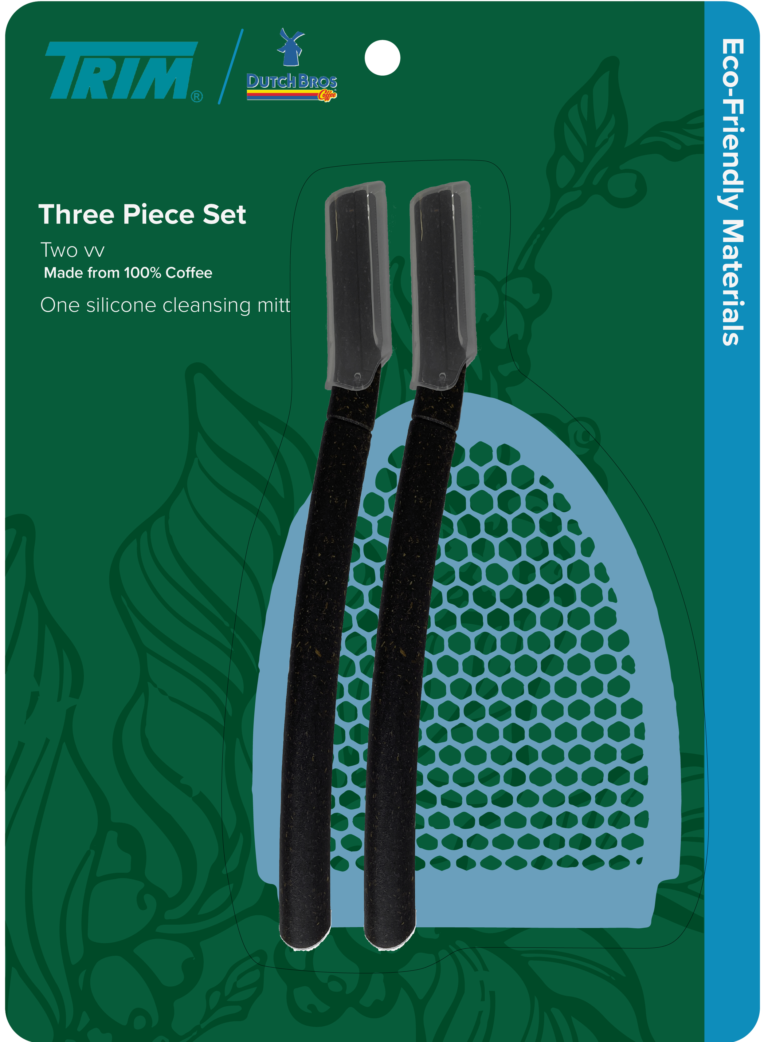
Once I established the two most plausible interpretations of the brief, I began designing. I started with the eco-friendly-focused approach because it was less defined than focusing on a brand collaboration. I used earth tones and some brand colors of Trim and Dutch Bros. I also pulled coffee-related patterns from Shutterstock because, in many previous projects, my team focused heavily on using licensable content from Shutterstock to save time while achieving a high-quality and polished result.
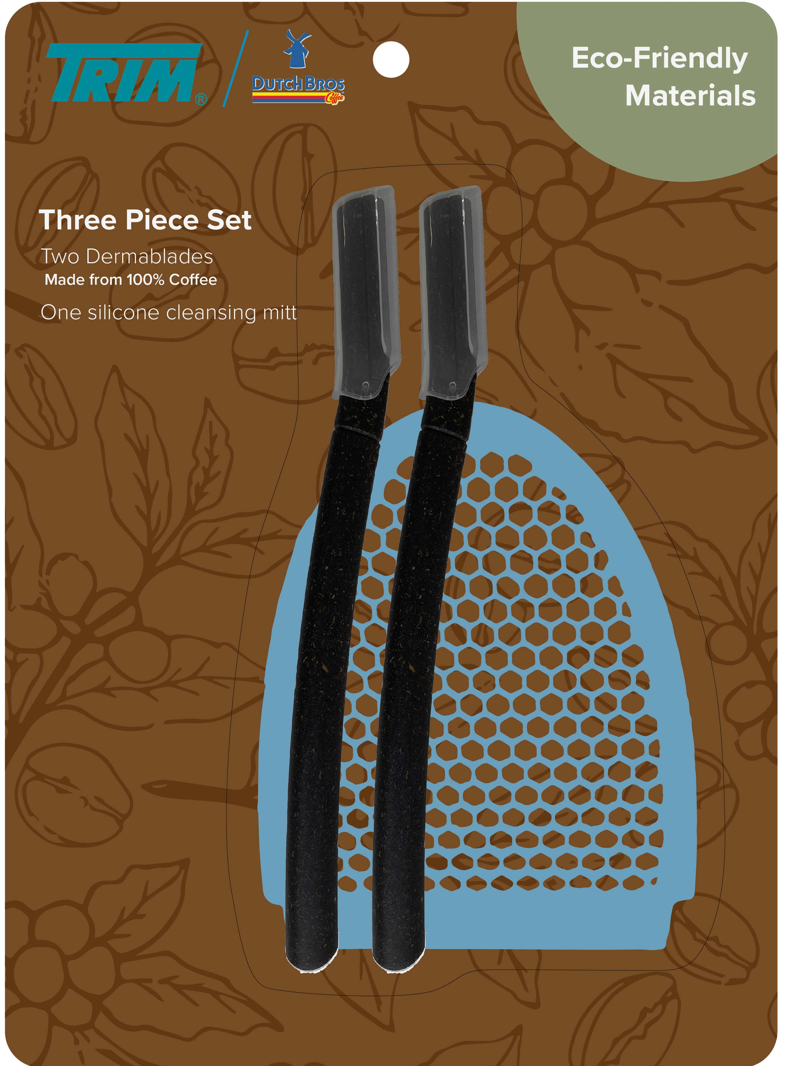
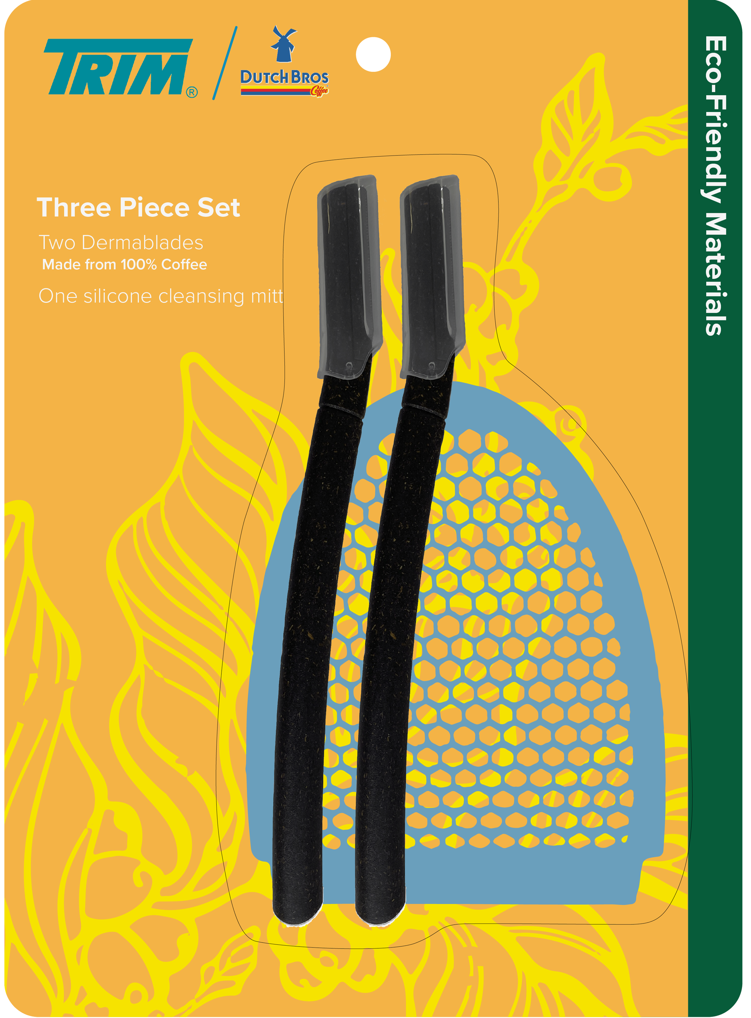
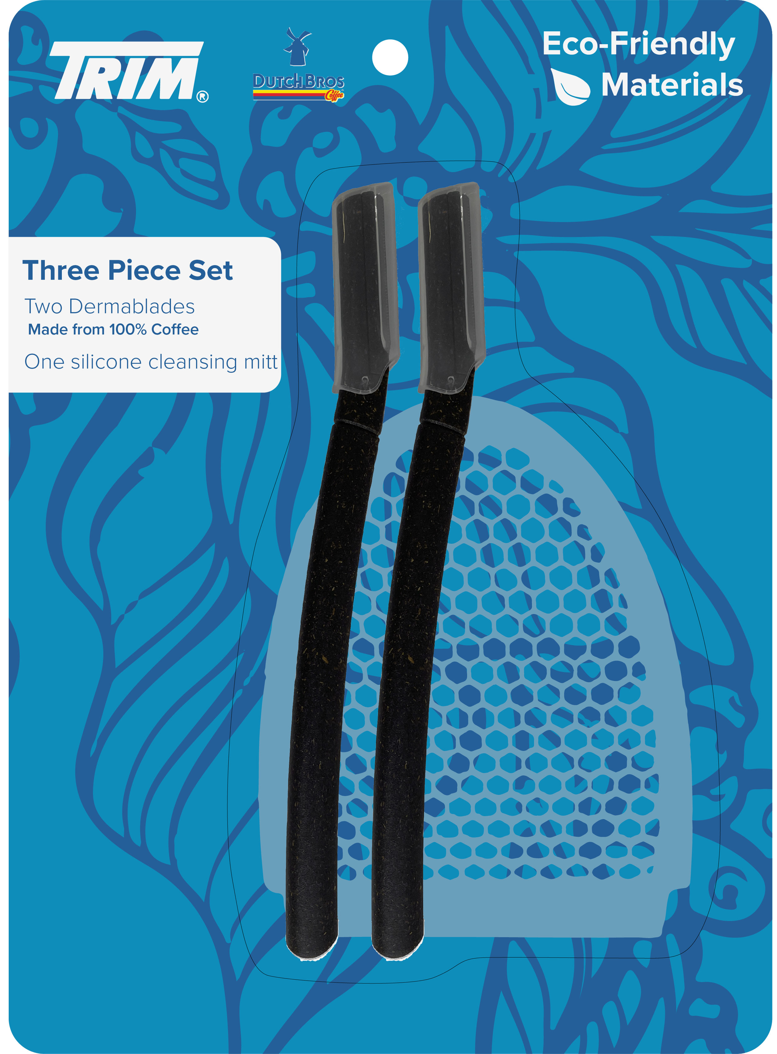

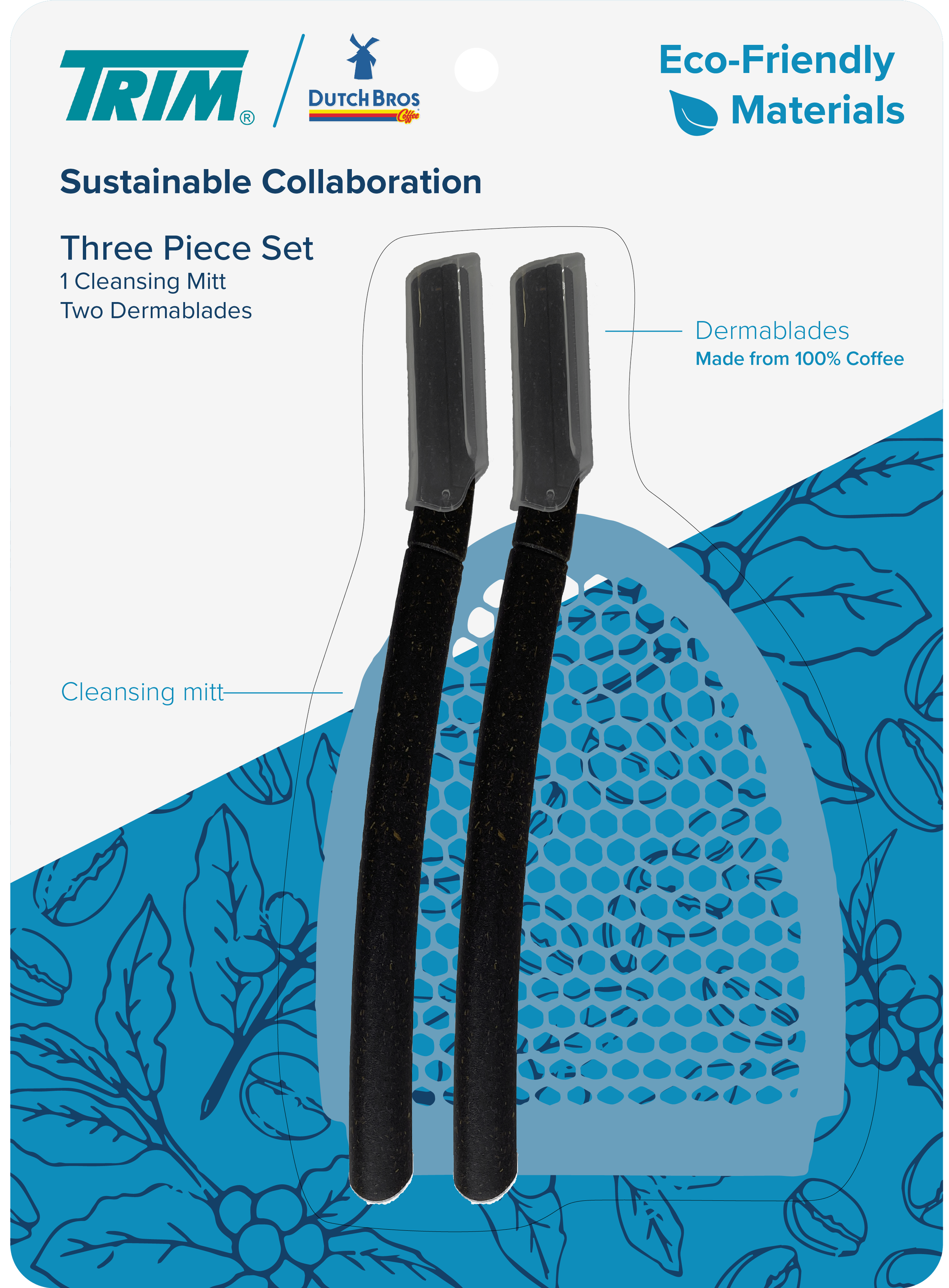
Next, I focused on the brand collaboration aspect, focusing primarily on Dutch Bros. branding. I used color to create hierarchy and used the Dutch Bros. windmill logo as an easily recognizable focal point that would catch customers' eyes and encourage them to pick it up.
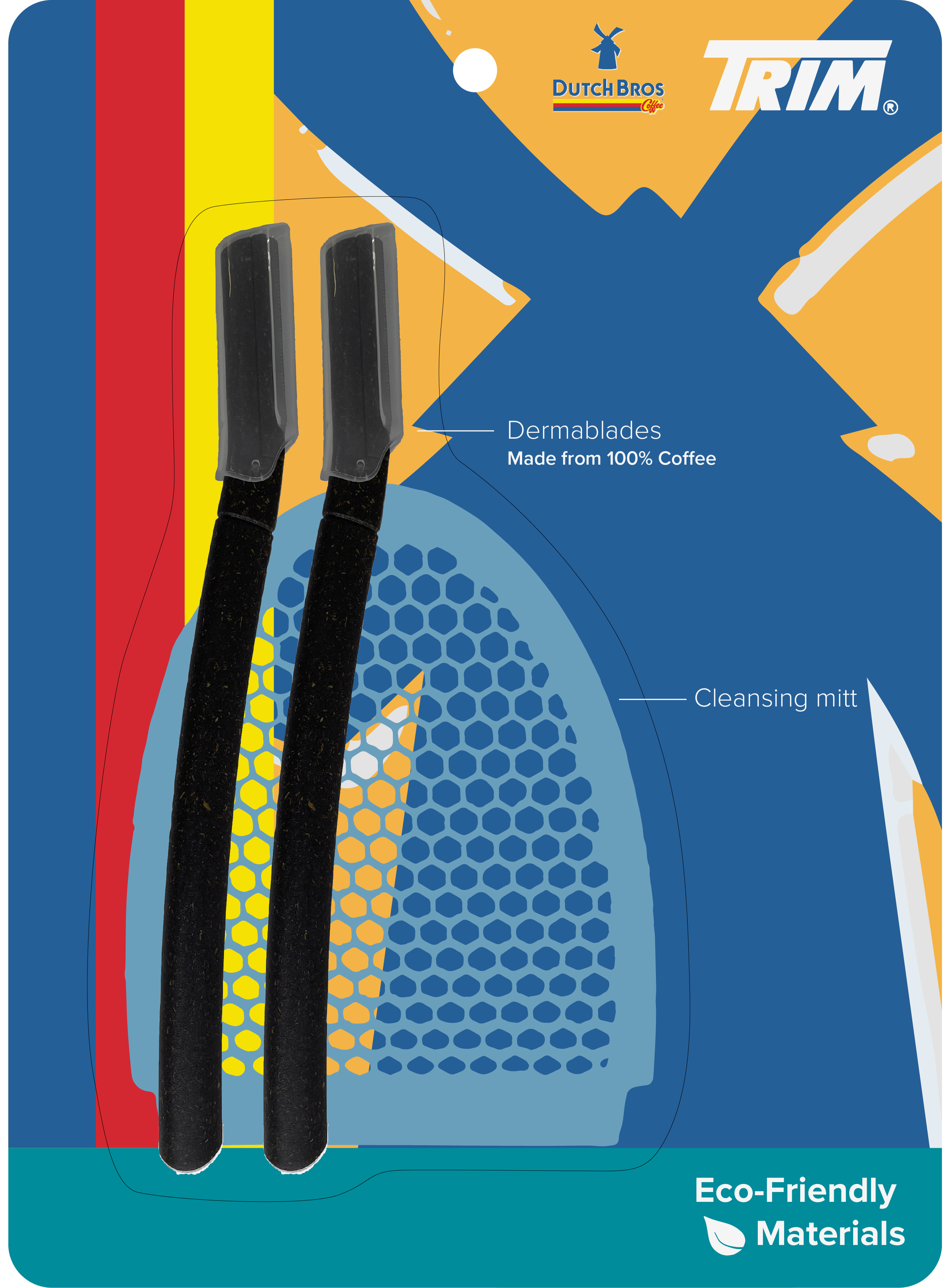
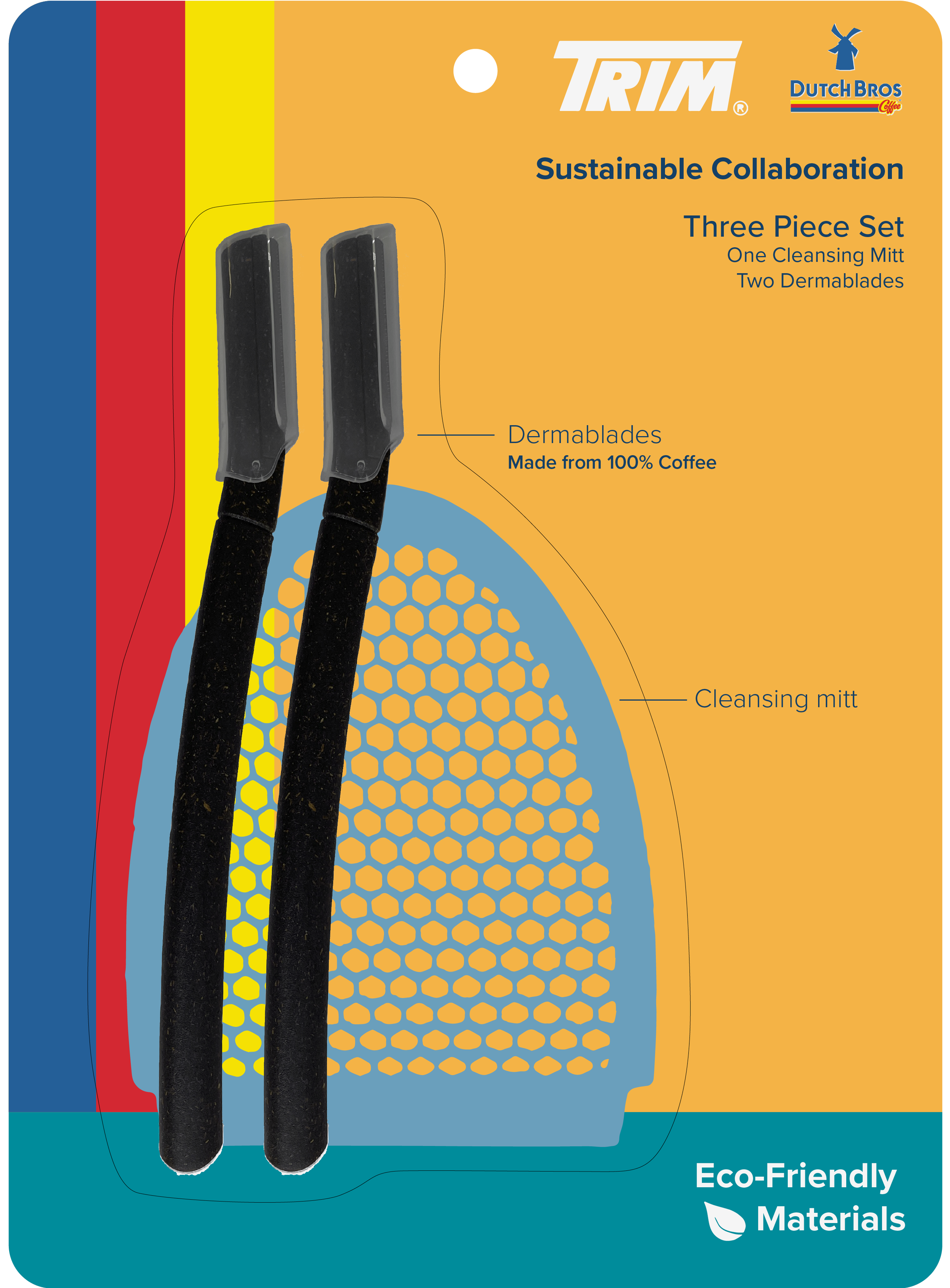

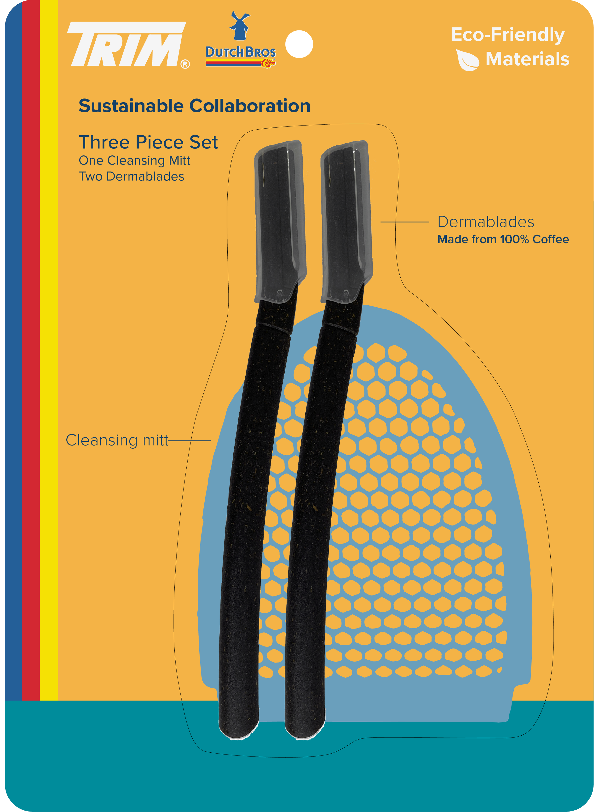
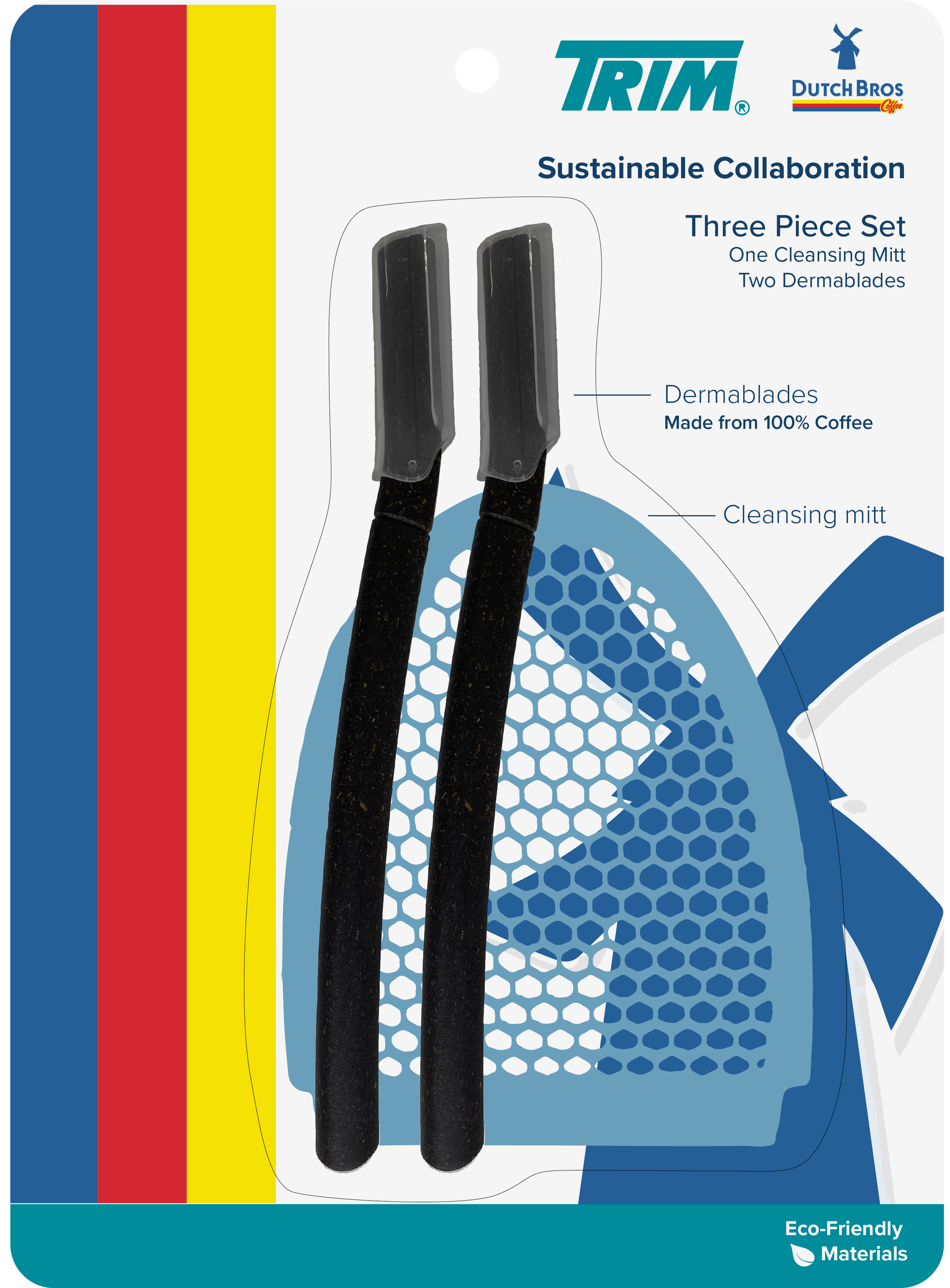
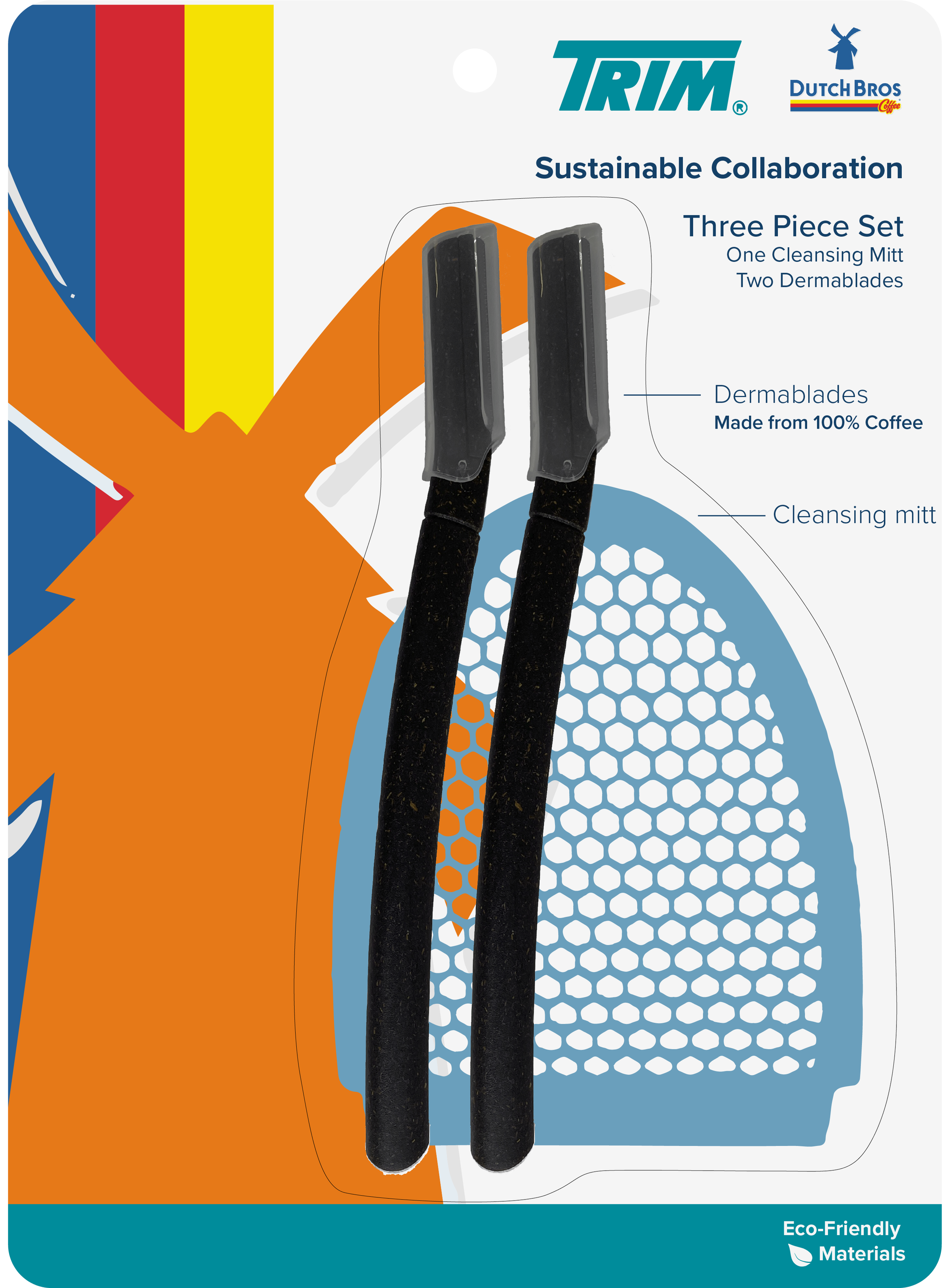
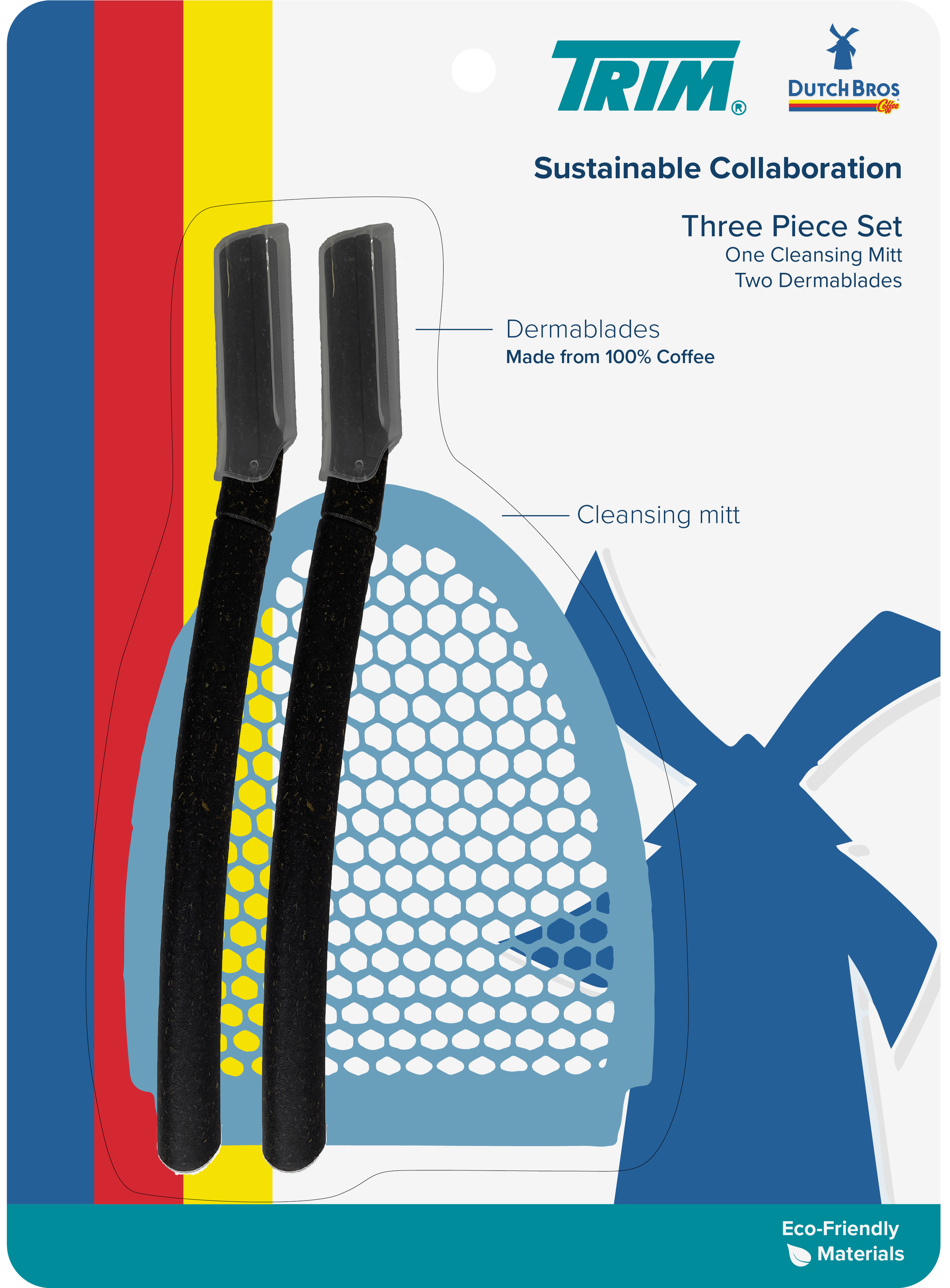

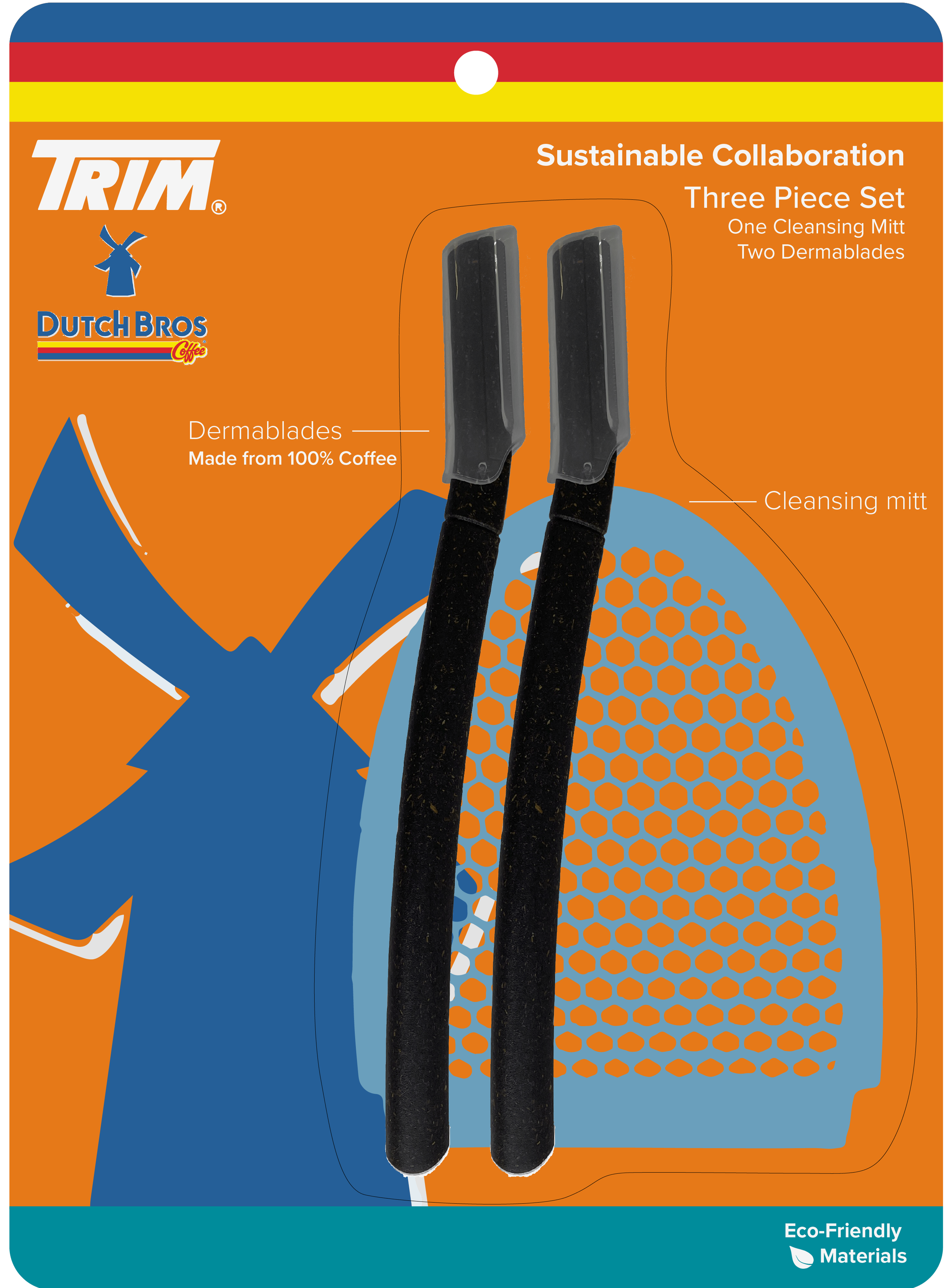


After presenting the initial designs to the creative manager, we decided it would be most effective to move forward with the brand-focused packaging. The immediate feedback was to emphasize the Dutch Bros. type logo and include more of the Trim brand color. I made these edits and then worked with the creative manager and VP of innovation to select the three best options.
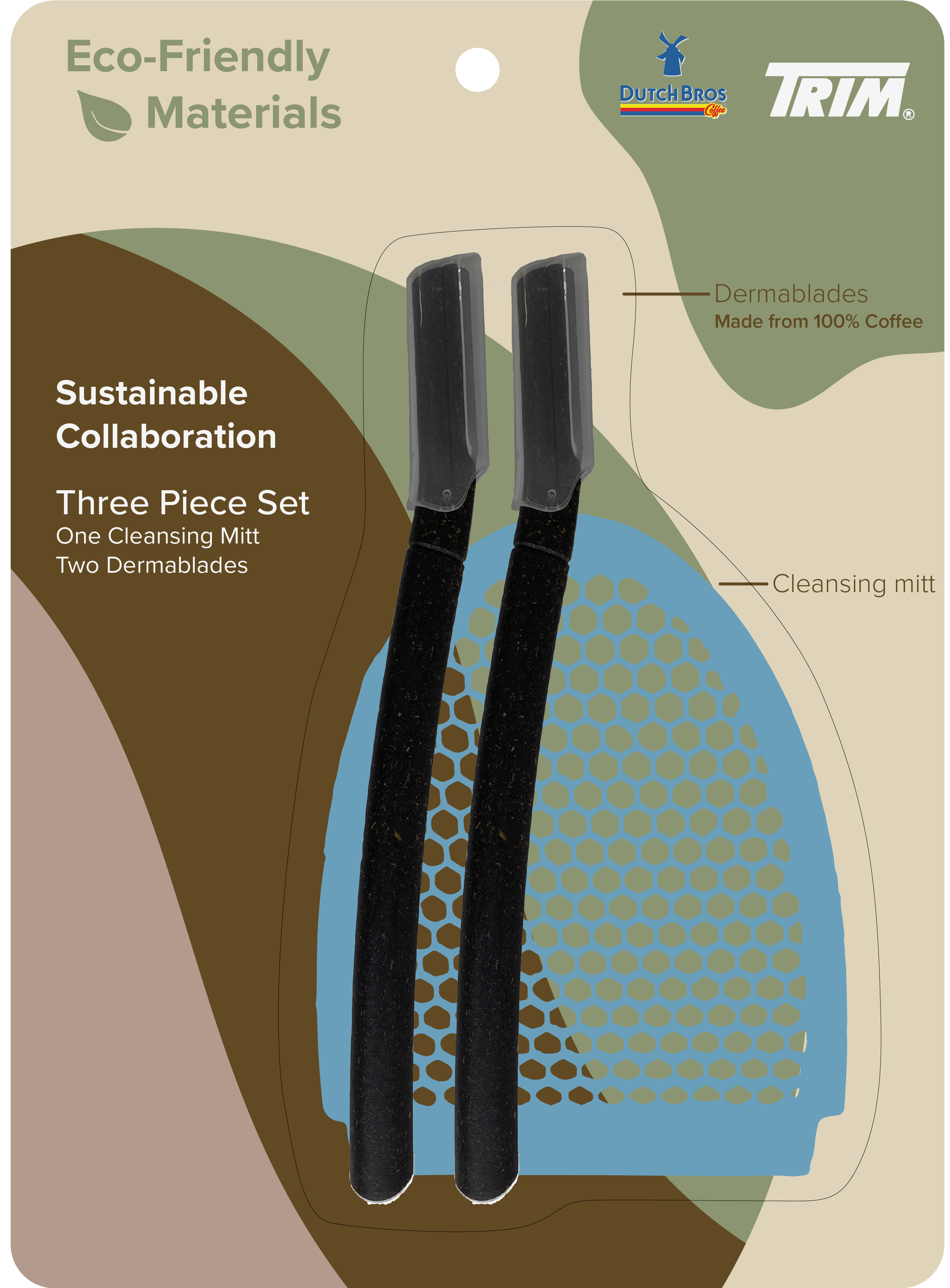
Next, I made a three one-page pitch presentation that included the three selected packaging designs, brand logos and colors, and the included products to scale. Finally, I printed them and handed them off to the VP of innovation for a later presentation.


Results
The outcome of this project was three packaging designs for a Trim and Dutch Bros. collaboration, as well as three options for one-page pitches for the creative manager and VP of innovation to present the concept.