Micro Site
This project is a microsite built from the ground up. Rather than redesigning an existing website or concept, I developed the idea for RomCon, a conference dedicated to romance novels after listening to “The Clinch,” a podcast episode from 99% Invisible.
Brief
The scope of this project was to design an interactive microsite for mobile and desktop with at least four pages using Adobe XD. A microsite contains branded information promoting an event. An effective design communicates clearly with cohesive visual language, considers the differences between desktop and mobile and translates the elements and hierarchy in clear yet surprising ways, and incorporates interactions that enhance the user experience.
Ideation & Exploration
This project was inspired by “The Clinch,” an episode from the podcast 99% Invisible. While I am an avid reader, romance has never been my genre, but this episode sparked genuine curiosity. It inspired me to develop the idea for RomCon, a conference all about romance novels which I used as the subject of this microsite.
Design Process
Once I flushed out the concept for the conference, I began laying out the information architecture. This helped me to organize the content and begin planning key elements of the site such as the navigation. I then got feedback from my peers and continued to refine the information layout. In this stage, many details were shaped and reshaped.

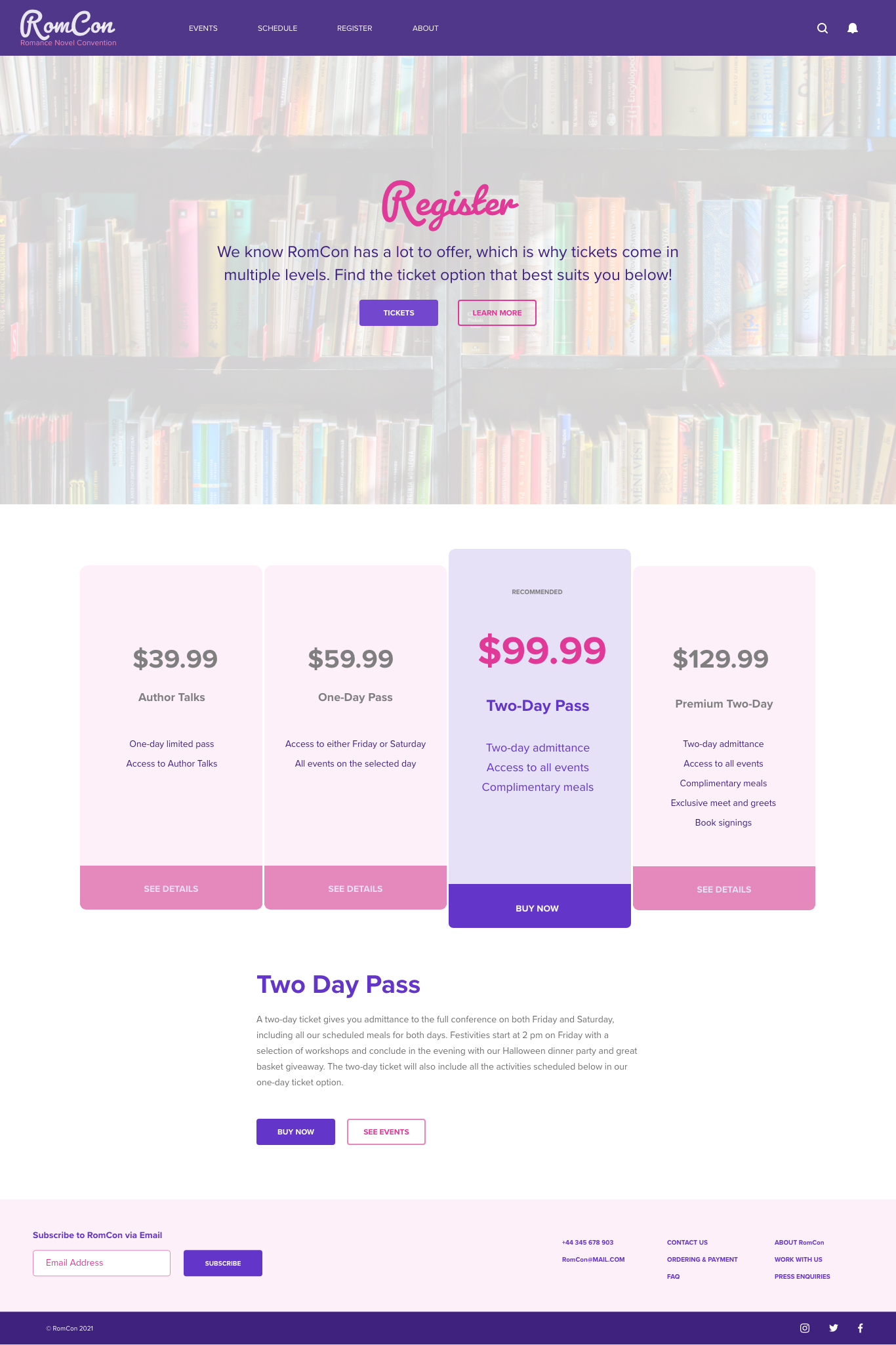
Next, I designed wireframes for a home page, events page, and schedule. When reviewing the wireframes, I realized that separating events and schedule did not make much sense so I omitted the schedule and included a registration page describing different passes that could be bought to the event. Then I made the first mockups using XD.


While these compositions were generally on the right track, they lacked visual interest making them feel heavy and boring which is not conducive to advertising the conference. There were multiple factors contributing to this including the imagery and use of color. I changed some of the images and incorporated more of the secondary color, pink.


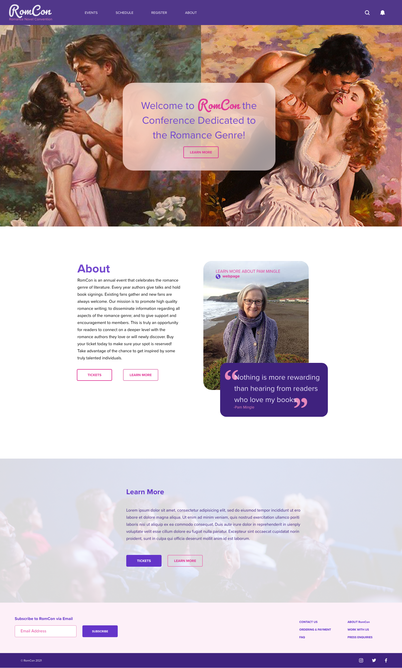
Despite the changes, the site was still somewhat dull. It was still not engaging or very representative of the content. Because the idea for the event was inspired by “The Clinch” episode of 99% Invisible it only seemed logical to include imagery of clinches as painted by renowned romance novel cover artist, Max Gisnburg. I also added more opportunities for the interaction. At this stage I began designing the mobile version because I was not planning on making any more major revisions. This way I could edit the two independently without having to make too many changes to one or the other.


The mobile design posed a unique challenge because there were numerous elements that needed to be translated including photos and interactions such as buttons. It is important that the same information is displayed but in a distinct way that is suited for the mobile screen and maintaining interest. One novel feature of the mobile version is the collapsible menu which contains the navigation.

mobile design art boards in XD
I made some final adjustments to elements like spacing and cleaned up interactions in XD. To enhance the user experience, I added a payment form and thank you notification after the registration page.
Results
The outcome of this project is an interactive microsite for mobile and desktop. You can interact with the site using the links below which will redirect you to the project.