L.L.Bean Internship Lander Page
In this project, I worked with a team of interns and human resources management to redesign and update the landing page for the internship program on the L.L.Bean careers website. I was responsible for creating wireframes and mockups and guiding interns with little to no experience in design through the process.


Brief
This project's scope was to redesign the landing page for the L.L.Bean internship program on their careers website. Every year, a small group of interns from the program work together to find exciting ways to update the page, maintaining an accurate representation of the ever-growing and evolving program.
Our goal was to modernize the page and make it easy to navigate without making it extraordinarily different from the existing pages on the website. We also wanted to make the page more adaptable by removing aspects that date it, like years of specific intern classes.
Ideation & Exploration
Creating Identity
Because the site had a reasonably well-defined style to follow, we found other ways to get creative! We first did this by introducing the term "beantern" to the public. Many interns and managers began calling us "beanterns," combining L.L.Bean and intern. This title made us feel more connected to each other and the company, but it was also a great way to brand the program.
After researching other companies with revered internship programs, such as Adobe and Disney, I found that they also have unique names for their interns and a hashtag to match. Adding a hashtag utilizes social media to meet potential interns where they are and increase awareness of the program. Although it was initially challenging to get the human resources leadership on board, they agreed to use the term on the site and endorse the hashtag.
Gathering Materials
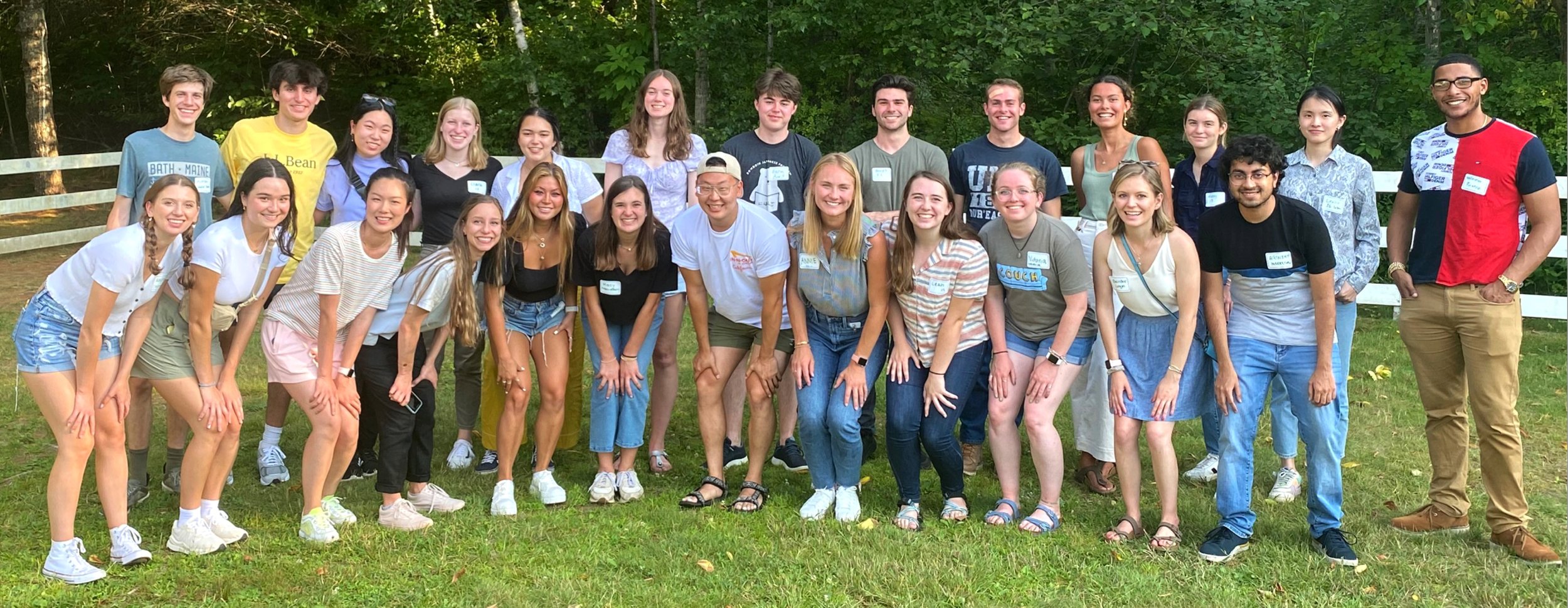
Next, we experimented with updating imagery on the site. All photos were at least two years old, dating to the summer before COVID. Since then, the internship has been entirely remote. While my cohort was primarily remote, we had the opportunity to visit Freeport, Maine, see the headquarters, and get to work together in person. During this time, we took many photos that we would later be able to use on the site.
Design Process
I began by assessing the site and compiling my critiques. I also met with my team to see if they had any feedback. Because none of them were designers, they had minimal input for structure but excellent ideas about new content to include.
Anchor Links
One of the first callouts about the page was that it was extremely long. To make it more approachable and helpful, I proposed adding anchor links and left navigation to help prospective interns quickly find the information they are looking for.
At first, our leadership rejected the anchor points because they would only be on the internship page of the site, making it stand out. In a later meeting with our leadership, we walked through a mockup of the page in Sketch, where the extreme length of the page was far more evident than in the beginning stages. The anchor points were reconsidered and eventually approved to optimize the user experience.
Addressing the Fold
One of the first things I noticed when assessing the site was that many headers fall on or below the fold because they are below the primary images. Despite presenting the data from Nielsen Norman Group that "the 100 pixels just above the fold were viewed 102% more than the 100 pixels just below the fold," the final decision was to keep the headers below the primary images.
Hover Descriptions
One of the more exciting parts of this process was including more information about specific intern positions rather than the program as a whole or the culture at L.L.Bean.
There are 15 different departments with unique purposes and projects that we wanted to highlight. Rather than listing out all 15, making the page overwhelming, we opted for a hover list, revealing the description that prospective interns hover over.
Results
The outcome of this project is the internship lander on the L.L.Bean careers site with updated copy, imagery, and UX considerations.


