L.L.Bean DEI Lander Page
In this project, I worked with a team of interns and human resources management to create the lander page for diversity, equity, and inclusion surrounding careers at L.L.Bean. I was responsible for creating wireframes and mockups and guiding interns with little to no experience in design through the process.
Brief
This project's scope was to create a landing page providing information about L.L.Bean's diversity, equity, and inclusion (DEI) efforts and initiatives for its employees. L.L.Bean has a page about DEI on their commercial site but wanted to include something specific about being an employee rather than the company's overall stance.
My team was responsible for writing copy, researching efforts, and interviewing employees to make the page as holistic as possible. Our goal was to make the page match the existing landers on the site while making it visually exciting and easy to navigate.
Ideation & Exploration
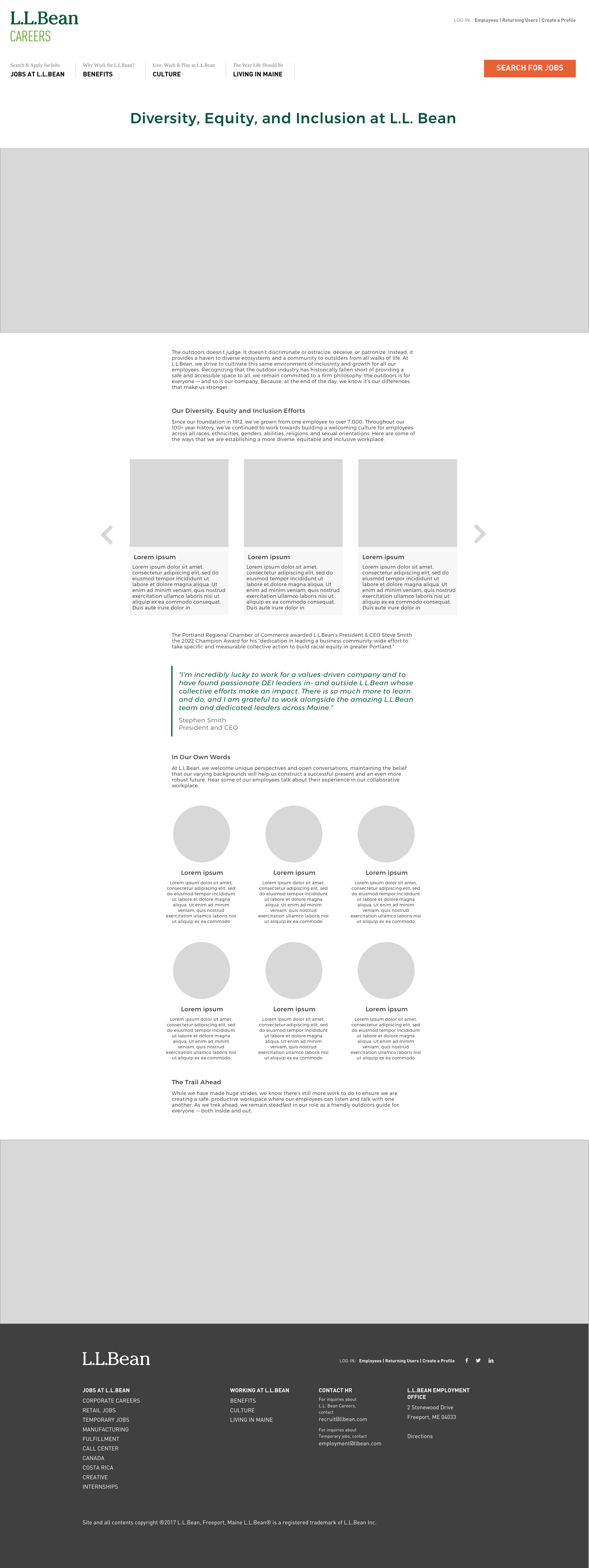
While my peers began writing copy, researching and interviewing, I started making wireframes based on existing pages on the site and what I thought would work best. Carousel layouts were prevalent on the site to display photos, and hover-reveals were used for small text sections, but we wanted to make something that showed images and text together.
Design Process
I began making wireframes using the concepts my peers expected to see and made some that I felt were the best way to display the information.


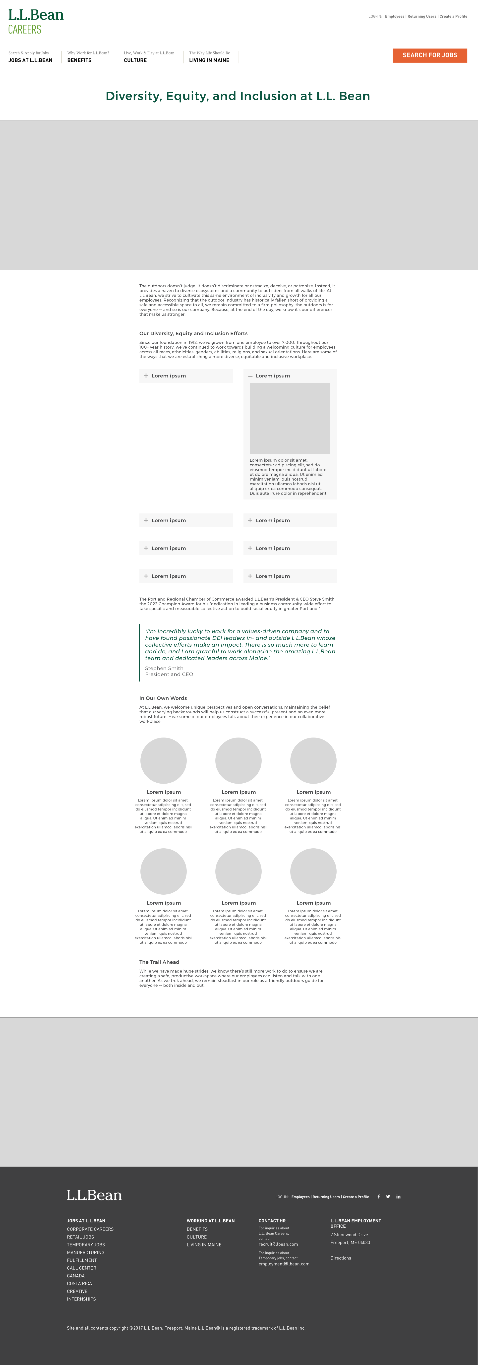
My team decided on the expand and collapse layout that would feature images and allow users to click to reveal text describing each initiative. Next, we had to present the design to the management of the HR team.
At first, we received pushback because it was unclear if the agency that maintained the site would be able to accommodate the request. Because I believed this was the best way to present the information, I took the initiative to reach out to the team lead to better understand their boundaries. I was pleased to learn they work in HTML and CSS and that our layout was very doable.
Special Callout
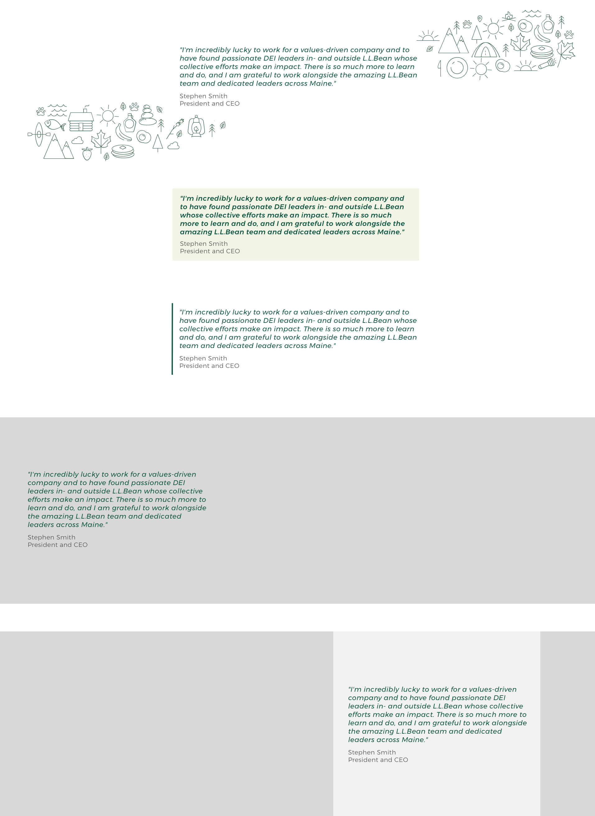
Steve Smith, the president, and CEO of L.L.Bean, received the Portland Chamber of Commerce 2022 Champion Award, so we wanted to call out this accomplishment and include a quote from him about DEI. To make this callout more personal, I wanted an image of Steve rather than a traditional quote callout.
Once more, I reached out to the team lead at the agency to ensure that we would be able to use text over images rather than only an image so that screen readers would recognize the text for accessibility purposes. Once more, they were able to build the layout with no problem.
Overlap
I worked on this project at the same time as the L.L.Bean Internship Lander and often received feedback on both projects simultaneously. Because of this, I did not make mockups where the header is above the primary image. We received feedback that this layout is inconsistent with the rest of the site despite presenting the data from Nielsen Norman Group that "the 100 pixels just above the fold were viewed 102% more than the 100 pixels just below the fold."
Results
The outcome of this project is the DEI lander page on the L.L.Bean careers site, including new copy, images, and employee quotes.


